ABARTH REBRANDING
Journey logbook
Work done
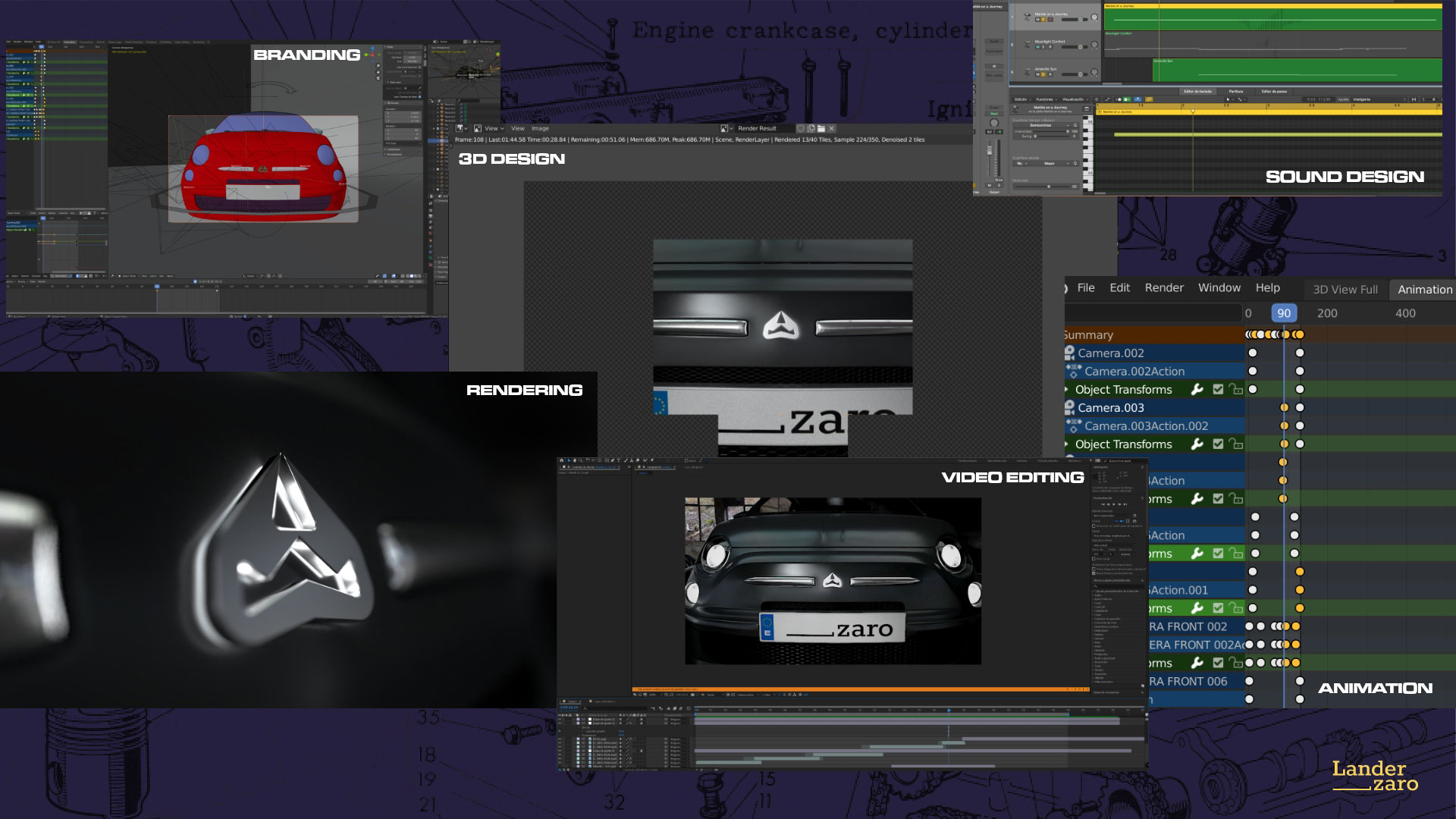
BRANDING + VISUALS
MADE IN
2020
TOOLS
ADOBE CREATIVE SUITE + LOGIC PRO X+ BLENDER
Website

Proud of our heritage, excited about our future.
Challenge
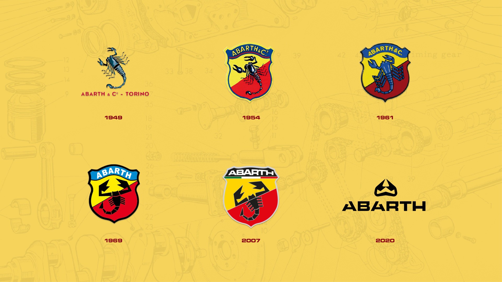
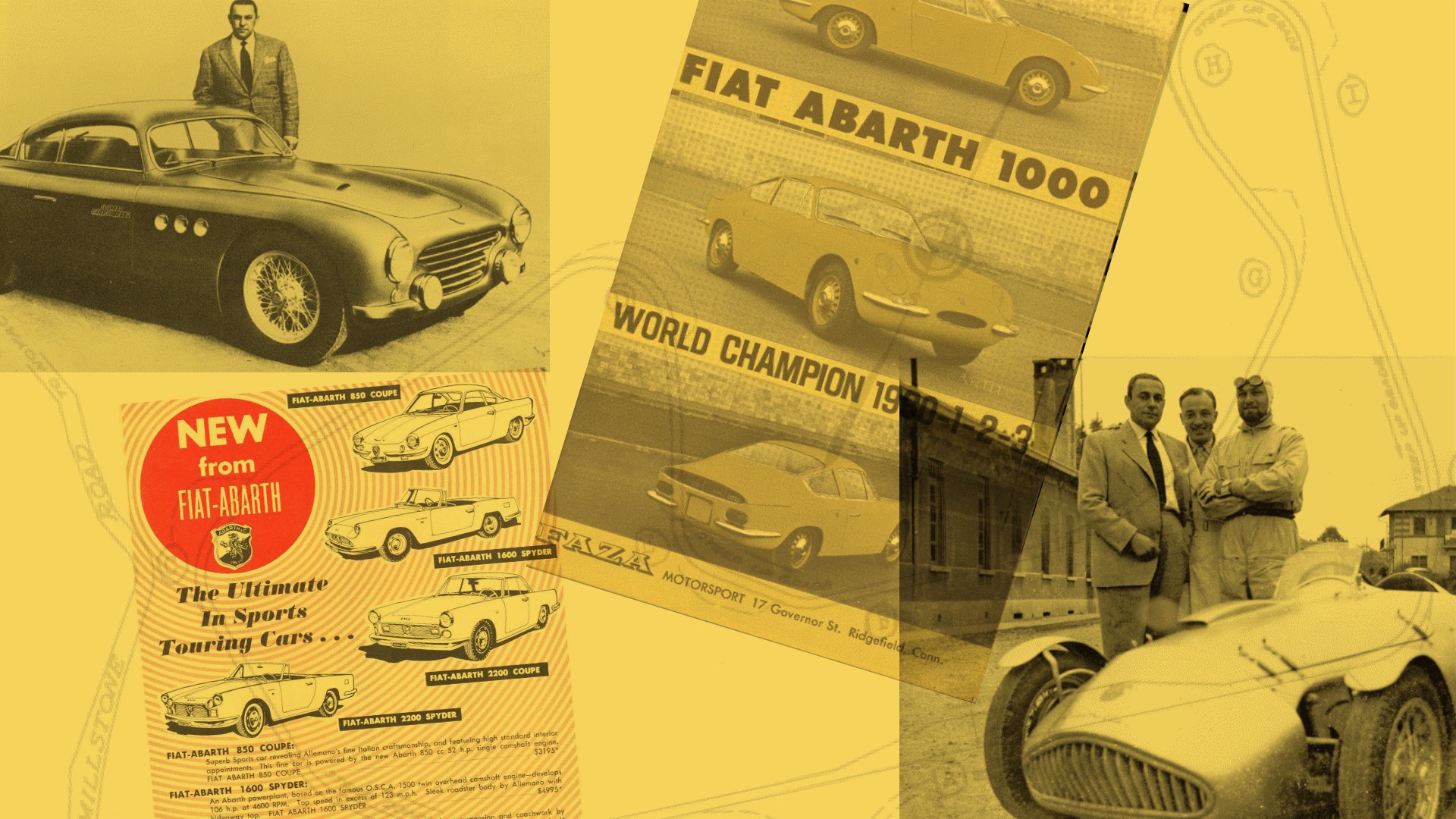
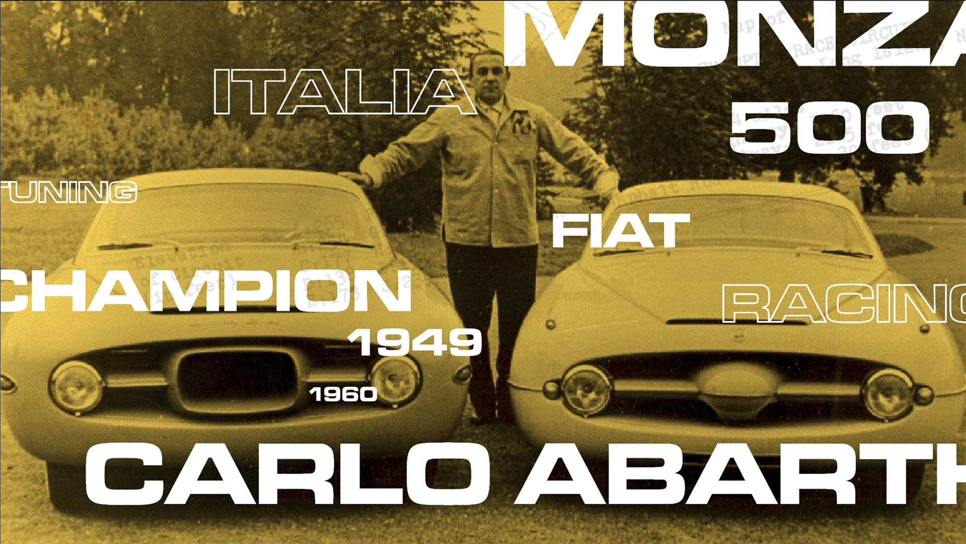
The challenge for the Abarth racing car company's rebranding was to modernize its image while preserving its historic essence. As a renowned racing brand, Abarth needed a visual identity that could resonate with the present and project a promising future. The rebranding aimed to infuse a youthful and dynamic spirit into the brand without losing touch with its iconic heritage. Striking the right balance between tradition and innovation was crucial to ensure the new identity appealed to both existing fans and younger audiences.
Goal
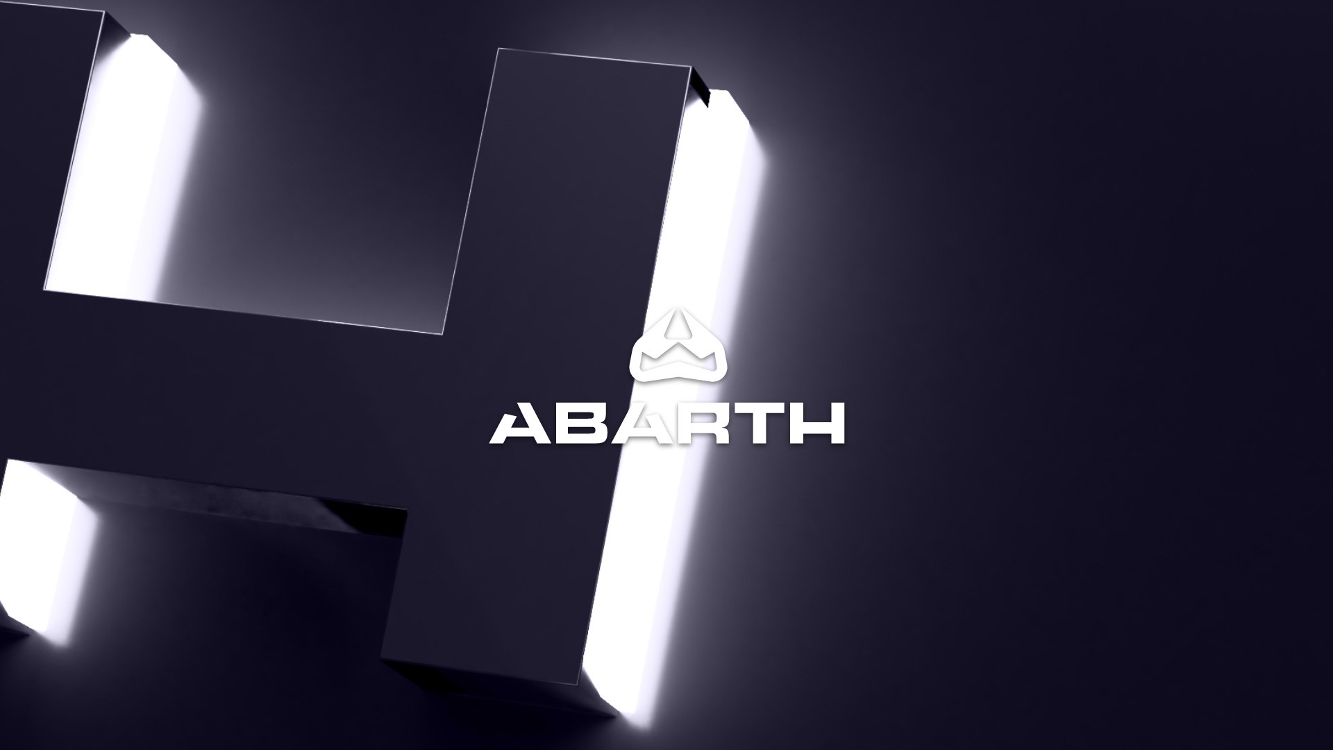
The primary goal of the Abarth rebranding was to create a fresh and contemporary visual identity that exuded a sense of adventure and energy. By blending the image of a racing pilot with the mythical scorpion from its previous logo, the new design sought to represent a bold, adventurous, and forward-looking Abarth brand. The objective was to appeal to a younger demographic while honoring the company's rich heritage, instilling pride in its legacy, and sparking excitement about the future.
Solution
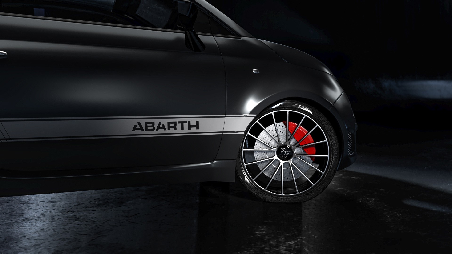
A dynamic and concrete solution was developed, that combined a racing pilot with the mythical scorpion in the logo, symbolizing speed, strength, and adventure. A vibrant color palette, modern typography, and captivating brand imagery infused the brand with a youthful and energetic spirit. The cohesive identity extended to brand collateral and a user-friendly digital presence. The result was an invigorated brand that celebrated its legacy while projecting excitement for the future, reaffirming Abarth's position as a prominent player in the racing and sports urban cars industry.
